
When choosing the right color for your Pleasant Hill, CA house, it’s more than about finding a shade that you like. It’s about making a decision that enhances the comfort and appeal of your living spaces and boosts your home’s value. However, navigating the vast sea of color choices can be daunting, and without proper guidance, it’s easy to fall into common pitfalls.
In this article, we’ll explore some of the most commonly regretted color choices for both interior and exterior house painting, explain why these colors might cause homeowners grief, and provide insights on how to steer clear of these potential mistakes.
The Pitfalls of Popular Color Choices
When painting your Orinda, CA home, some color choices might seem appealing at first but can lead to disappointment down the road. Understanding these pitfalls can help you make more informed decisions and avoid colors that might seem trendy but are actually impractical for long-term satisfaction.
1. Overly Bold and Bright Colors
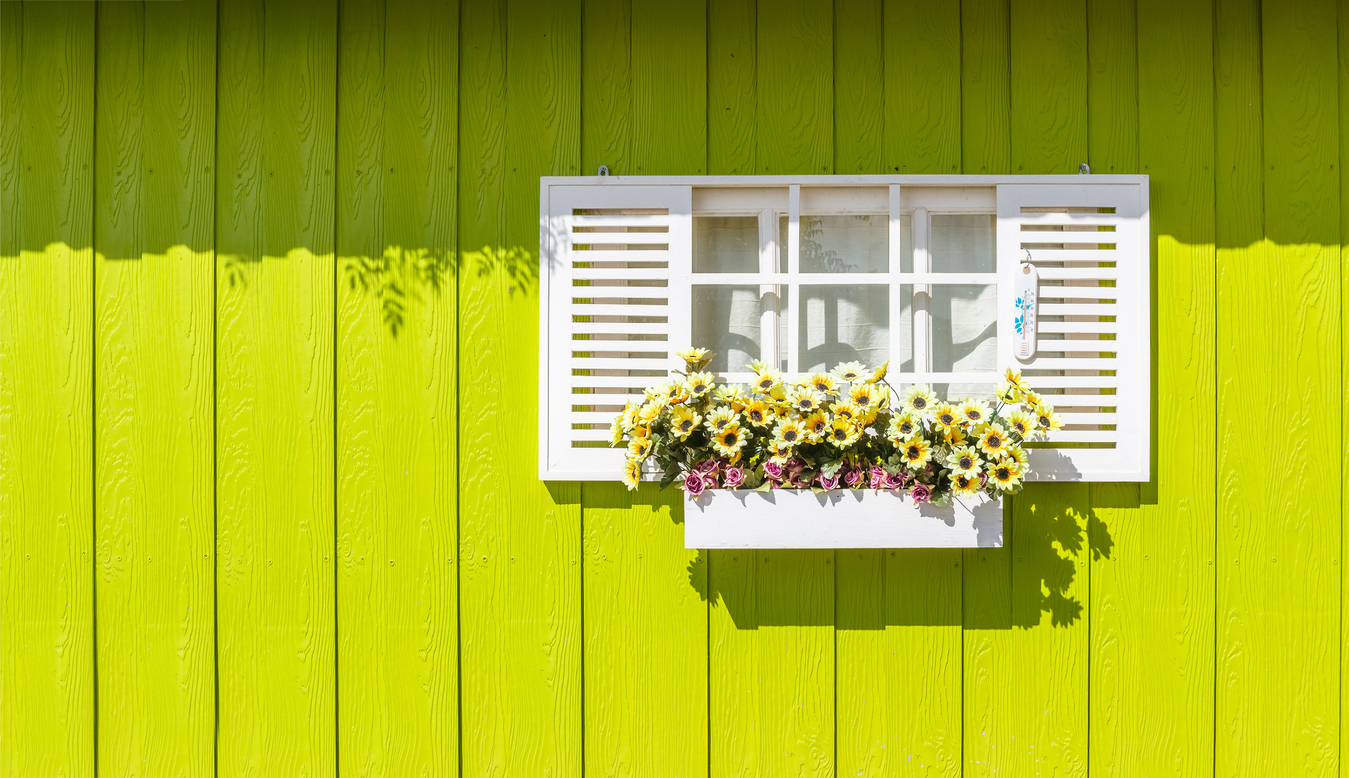
Bright colors like vivid oranges, electric blues, or lime greens can energize a space but can also overwhelm the eyes over time. These shades are stimulating, which might be fun for a short-term project or a single accent wall, but covering large areas or exterior walls with these hues can become tiresome. Additionally, bright colors can make a room feel smaller and may not complement existing furniture and decorations.
2. Very Dark Colors
Dark colors such as charcoal, deep blue, or forest green add a touch of sophistication and drama. However, they can pose several challenges. These colors tend to make spaces feel significantly smaller and darker, absorbing much of the natural light that enters the room. They also require more maintenance as dust, watermarks, and imperfections show up more visibly than lighter shades.
3. Trendy Colors
While choosing the latest trendy color is tempting, these choices can quickly become dated. For instance, what is considered “in” this year might fall out of favor next year, leaving rooms looking out of touch. The key is balancing trendy elements with classic colors that stand the test of time, ensuring your home remains stylish and appealing for longer.
4. White or Very Light Colors
While white or very light colors can make a space feel larger and more open, they also show dirt and smudges far more quickly than other colors. This can lead to frequent repainting or touch-ups, especially in high-traffic areas. Additionally, white walls might lack personality and warmth without the right home furnishings and decor to balance them.
5. Glossy Finishes
Choosing the right finish is as crucial as the color itself. Glossy finishes can make colors pop and are easy to clean, but they highlight every little imperfection on your walls, from nail holes to uneven textures. Matte finishes, while less vibrant, can hide these blemishes more effectively.
The Impact of Wrong Colors on Home Aesthetics and Resale Value
Selecting the wrong paint color for your Concord, CA home can have more than just aesthetic drawbacks—it can also significantly affect your home’s marketability and resale value. Understanding these impacts can guide homeowners in making choices that enhance their home’s enjoyment and its financial value.
1. Aesthetics and Spatial Perception
The colors chosen for your Lafayette, CA home’s interior and exterior can drastically alter the perception of the space. Dark colors, while stylish, can make rooms appear smaller and less inviting, which might not appeal to potential buyers who prefer open, airy spaces.
On the other hand, unconventional bright colors can be seen as jarring, distracting from a home’s features rather than enhancing them. Neutral colors are safest as they make spaces appear larger, brighter, and more adaptable to various personal styles.
2. Buyer Appeal
When it comes time to sell, homes in Walnut Creek with neutral color schemes generally attract more buyers. Neutrals serve as a blank canvas, allowing potential buyers to envision their own lives and decor in the space without the distraction of bold wall colors. Homes with highly personalized paint choices often require buyers to plan for additional painting expenses, which can make the property less appealing or reduce the offer price.
3. Maintaining Value Over Time
Colors that are timeless and versatile generally maintain value over time. Trends may come and go, but colors like soft greys, beiges, and off-whites remain in vogue, appealing to a broad audience and seldom necessitating changes as home fashions evolve. This stability can be important in maintaining or increasing a Moraga, CA home’s value, as it reduces the need for frequent updates.
4. Enhancing Features
The right colors can enhance the architectural details and features of a home in Concord, CA. For instance, using a contrasting color on the trim can highlight these elements, making the architecture stand out. However, the wrong colors might clash with the home’s style or obscure its attractive features, diminishing curb appeal and potentially lowering interest among prospective buyers.
5. Psychological Impact
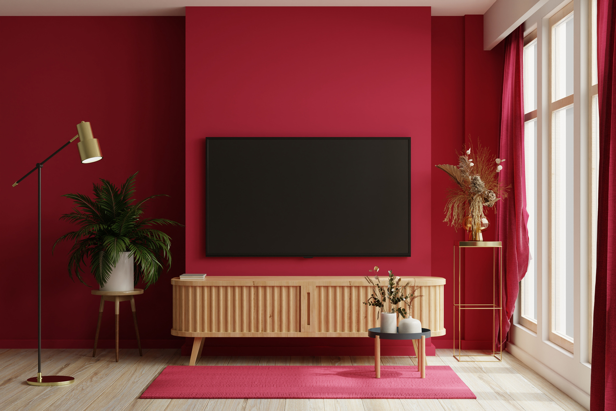
Color psychology plays a significant role in how spaces are perceived. Colors like blue and green are often associated with calmness and tranquility and are usually well-received in homes. Conversely, overly vibrant colors such as red or yellow can stimulate discomfort in large doses, which might be off-putting to some individuals looking for a relaxing home environment.
Key Considerations for Choosing House Colors
Selecting the right paint colors for your home is a critical decision that influences not just the aesthetics but also the functionality of your spaces. Here are some essential factors homeowners should consider to make thoughtful and beneficial color choices:
1. Lighting
Lighting is pivotal in how paint colors are perceived in different settings. Natural light can dramatically alter the appearance of colors throughout the day. Before finalizing a color, observe how it looks in your home’s lighting at various times. For rooms with limited natural light, opt for lighter shades that help make the area feel brighter and more open.
2. Room Size and Configuration
The size and layout of a room can dictate which colors will enhance the space. Lighter colors make small rooms feel larger, while darker hues can add depth and warmth to more expansive areas. Consider the room’s function as well; vibrant colors might energize a home office or workout room, whereas softer shades can bring calm to bedrooms or living areas.
3. Existing Décor and Architectural Style
Your home’s current interiors and architectural design should guide your color choices. Historical homes might benefit from a palette that complements traditional architectural details, whereas modern homes can carry off bolder, more contemporary colors. Ensure your chosen colors harmonize with your furniture, flooring, and fixtures.
4. Personal Taste and Lifestyle
While it’s essential to consider resale value and trends, your personal preferences should also significantly influence your decision. Choose colors that reflect your style and fit your way of life. Families with young children might opt for durable, washable paints, whereas those who entertain frequently prefer more formal, sophisticated colors.
5. Psychological Effects
Colors have a profound impact on mood and behavior. Blues and greens are soothing and ideal for bedrooms and bathrooms, promoting calm and relaxation. Energetic colors like reds and yellows can stimulate appetite and conversation, making them great choices for dining rooms and kitchens.
6. Color Trends
While it’s wise to avoid slavishly following trends, keeping an eye on current color trends can inspire and ensure your choices feel contemporary. Balancing trendy elements with classic sensibilities can keep your home feeling updated yet timeless.
Conclusion
Choosing the right paint color for your home is a decision that extends beyond mere aesthetics. It involves considering how colors influence the mood and feel of your spaces, their impact on room size and lighting, and ultimately, their effect on your home’s market value. As we’ve discussed, venturing into this task armed with knowledge about the pitfalls of popular color choices and the benefits of consulting professionals can significantly enhance both the process and the results.
If you’re planning to refresh your home’s paint, consider the long-term benefits of working with Custom Painting Inc. Our commitment to quality and customer satisfaction ensures that your painting project will enhance your living environment and possibly increase your home’s value. Reach out via our contact form today or call us at 925-686-0903 to start your journey toward a beautifully painted home that reflects your personal taste and stands the test of time.