

Many people are in love with historic homes. Aside from keeping the town’s history alive, they exude allure and charm and can make any neighborhood more beautiful.
Affordable interior painters near me in Pleasant Hill, CA, know these historic homes’ financial and tourist potential.
That’s why they’re around – to help bring your historic homes to their past glory and preserve them for future generations. Well-preserved historic homes can also enjoy tax exemptions and benefits from the local government, not to mention an increase in property value.
Indeed, owning a historic home has its advantages and charms. But it also comes with challenges, most especially regarding restoration.
Choosing colors for your historic home – what is your goal?
Paint color should be the least of your worries, right? Well, not really. Paint colors are some of the design elements that can make or break a room. The right paint color can either set the tone of the room or blend the space harmoniously.
But unlike exterior paint colors, which are likely subject to homeowner’s association guidelines, things can be a little more flexible with interior paint colors. Fortunately, most owners of these historic homes still prefer to maintain or bring back their original look and appeal, while a few want to make the interiors look a little modernized.
Whatever your end vision will be for your interior paint colors, you will want to try any of these suggestions to help you choose the best interior paints colors for your historic home:
- Try out different swatches
- Use a color visualization tool
- Seek professional advice (especially from a color consultant)
- Invest in quality paints
- Bring out your home’s existing architectural details
- Keep the door and trim colors in mind
Neutrals as interior colors for historic homes – yay or nay?
Color trends may come and go. However, some colors appear to have staying power, perhaps because they’re firmly rooted in the past.
While choosing colors is certainly up to you, some colors won’t feel right in historic homes. Examples of these colors are those belonging to the neutral family.
You may be surprised to hear that, considering that neutrals are some of the trendiest colors in interior design right now. Whites, grays, beiges, and greiges (gray and beige), to name a few, work well in newly built homes. However, the same might not be accurate in historic homes. Why is that so?
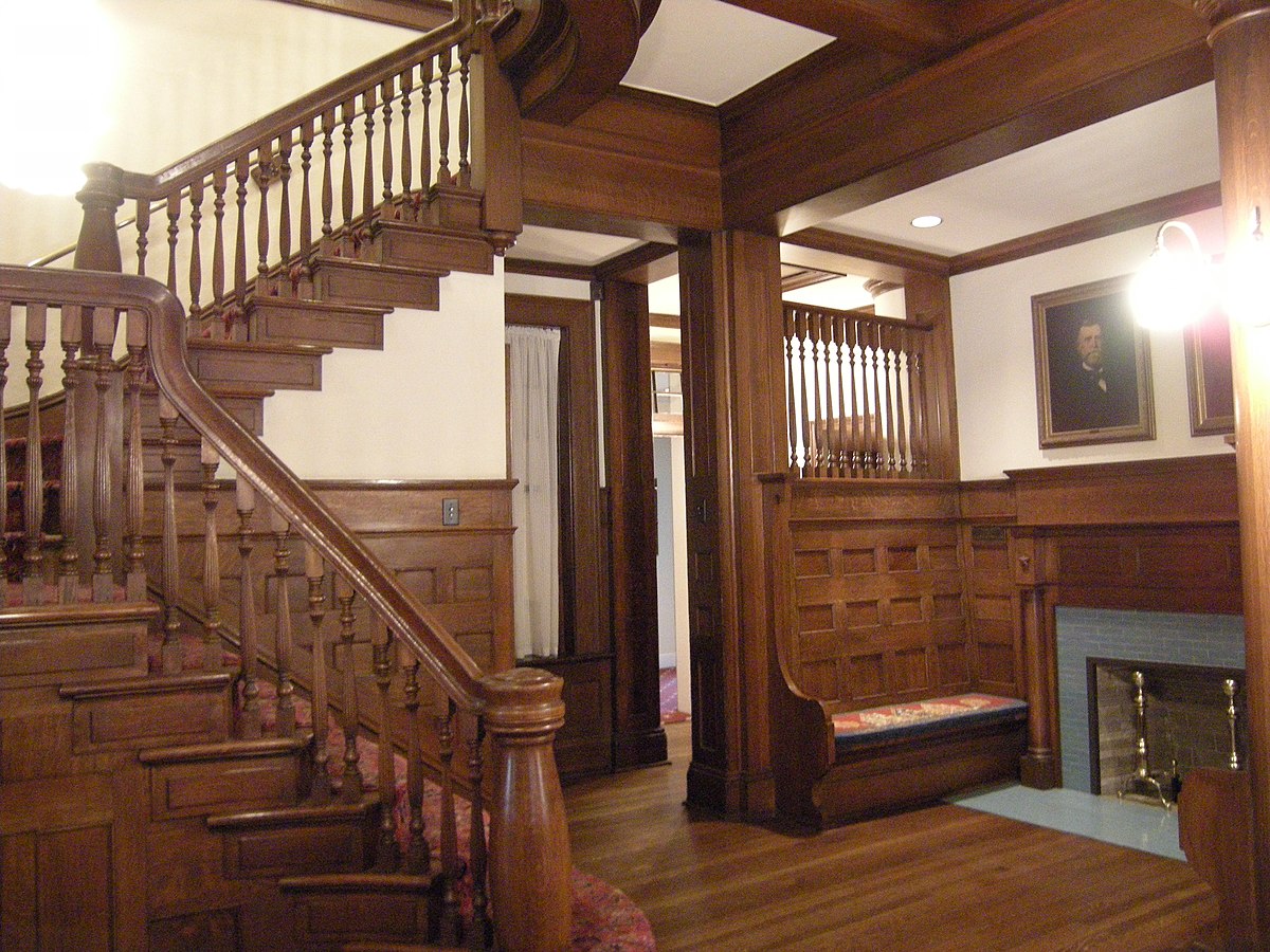
It’s probably because historic homes have certain architectural features, such as intricate woodwork, that lend themselves to a distinctive warmth and coziness that modern homes don’t usually have.
With colors, you want to preserve warmth while updating the look of your historic home’s interiors. For instance, getting that same warmth by using neutrals, such as solid white, can get a little tricky.
If your goal is to keep your historic home’s original look and feel, you should stick to more traditional or muted shades found in many historic homes.
You can find a “happy medium” with muted versions of traditional interior colors
Sticking to the traditional colors or going for the muted, lighter, or de-saturated versions of traditional colors may be the safest bet to maintain the history and character of your antique home. This is true, especially with the latter option, if you consider adding neutrals.
Instead of whites, grays, beiges, creams, or greiges, try introducing lighter and more muted shades of darker, richer colors that are usually found in historic homes, such as:
- Reds
- Darker blues (such as navy blue)
- Yellow
- Green (particularly mint)
- Purple
For instance, you can use pinks – which are lighter shades of red – such as salmon pink or old rose. Lighter versions of purple, like lavender and mauve, are also popular for interior walls. You can also refresh and brighten your spaces with pastel yellow, greenish yellow, or mustard yellow. That way, there’s still a color that will preserve the warm look and atmosphere that’s typical in historic homes.
Of course, you can also introduce neutrals to your home. But in this case, these neutrals should function as secondary or accent colors. For example, you can opt for shades of red, blue, or green that blend with some beige or light gray to counter the muted shades to give the space some modern edge.
Common interior colors of historic homes

Here are some of the most common interior wall colors found in historic homes. These colors are preferred over neutrals as they play off the intricate architectural details.
- Yellows – Yellows are tried-and-true colors for interiors. Yet, they can be too challenging to work with. Too much yellow and it becomes too bright, but not enough yellow and everything becomes washed out. If you want to incorporate yellow for your interior walls, go for a mustard shade and pair it with white for trim, baseboards, crown molding, and ceiling to give your room a more balanced look.
- Reds – Reds might be the first colors to pop into your mind when you think of a historic building. Red is also chosen as a historical color. Certain shades of red work well against stone features (such as pillars and fireplaces) and give interior spaces an air of warmth. You can also use red for doors or trim for a pop of color.
- Dark blues – Dark blues, particularly navy blues, provide the ideal complimentary backdrop for valuable collections or antiques or a gallery of rare artworks or precious family photos. Navy blue can also attract attention from anyone in the room with the right natural or indoor lighting.
- Purples – You may be surprised how versatile purple is. But it’s also not surprising why purple is experiencing a recent resurgence in interior design. Purple is always associated with royalty, wealth, and luxury, making them an excellent choice for historic homes. Dark and rich purples like royal blue can make your living rooms or bedrooms warm and cozy. Lighter shades, such as lavender, lilac, and mauve, are soft and soothing and can make a lovely alternative to popular pastel blues and pinks.
- Greens – Greens, especially mint green, can complement painted and stained trims and are compatible with several styles and levels of historic buildings. Mint green is a perfect shade to show off, especially if you own a Victorian, ranch-style, or Mid-Century modern home. Mint green will pair beautifully with white trim, baseboards, crown molding, staircase railings, as well as metallic accents.
Interior painting in Pleasant Hill, CAexperts will consult you before every step of the painting process, from surface prep work to painting, ensuring everything is completed to your satisfaction!